Project timeline

Project goal
Main goal was to develop a highly visual recipe-sharing app targeted for cooks of all levels, with a slight more focus on beginner cooks. With the help of instructions in the form of both text and photos, users would be able to cook easily and enjoyably.
Why is cooking at home important? What is the problem?
Nowadays people are eating out more or buying processed or frozen foods because they think cooking is too time-consuming and requires a lot of skills. Also, a lot of food is wasted or thrown away because people tend to buy groceries they don’t need at the moment and after not using them all they have to thrown them away. (In the US, 30-40% of the food is wasted. Source: usda.gov)
What do potential users think? (Interviews)
Which part of the cooking process do you find the most frustrating?
“... Planning for meals and looking for recipes usually takes the most time because sometimes I don’t have some of the ingredients in my pantry. I also don’t like to spend too much time on cutting veggies and thawing meat. “
What would you like to change about your eating habits?
“... I would like to not skip breakfast in the morning, and would like to start prepping my meals so that I don’t spend too much time on cooking during the week. I would also like to include more home-cooked meals. “
Do you plan your grocery shopping in advance?
“... Usually I have a general idea what I want to buy, like milk, coffee or other things I ran out of. When it comes to fruits, veggies and fresh food, usually I don’t know what to buy because I don’t know what to use those ingredients for. “
How experienced are you at cooking?
“... I don’t cook much other than an occasional bacon and eggs breakfast and toast. Usually I don’t have time to cook, or I’m too tired or would just like to spend my time doing something else. “
Based on the interviews and research done on people’s motives not to cook and to eat out or buy pre-made food and on the food waste, I came up with goals and objectives for the app.
Subgoals
TO MAKE THE COOKING PROCESS EASIER, ESPECIALLY FOR BEGINNER COOKS
Objectives:
🟥 100% of the recipes include step-by-step instructions
🟥 recipes can be sorted by difficulty level, so that users can filter them more easily
🟥 user testing will be conducted to see if more than 85% of users can complete the recipe
🟥 more than 50% of the recipes will be categorised as easy to cater to beginners
TO EVOKE INTEREST FOR HOME-COOKING
Objectives:
🟥 100% of recipes will include photos
🟥 based on algorithms and user’s interest, app will automatically suggest recipes user might be interested in
TO HELP USERS SAVE MONEY AND REDUCE FOOD WASTE BY USING INGREDIENTS THEY HAVE IN THE FRIDGE
Objectives:
TO HELP USERS SAVE TIME BY PLANNING THEIR MEALS AHEAD
Objectives:
🟥 each user should have the option to save a recipe for later, and to make a grocery list of ingredients the user needs to buy
🟥it will be determined which factor is the most important for users when they search for recipes so that search results can be adjusted accordingly
TO BUILD A TRUSTWORTHY COMMUNITY
Objectives:
🟥 have at least 70% of users that try a recipe post a photo, rate the recipe or leave a review
🟥 all users will have the option to create their own recipes and publish them
🟥 all users will have the option to leave reviews, rate recipes or leave a rating
Persona

User Flow
Before moving on to wireframes and the prototype, to help with the logic of the user interface and to make relationships between elements in the screens more clear, I decided to create a user flow. Use models help us understand user’s mental models about how they would use our product. My final user flow was very complicated, so here is a snippet of the final flow.
Complete user flow can be accessed here:
Complete user flow
A snippet of the user flow.
Low-fidelity wireframes
Using low-fidelity prototypes that I presented to my classmates to receive feedback, the goal was to see what has to be improved and changed before making high-fidelity prototypes. Potential users gave great feedback related to image size, element visibility such as internal nav within recipe details page, organization and information architecture. This valuable feedback enabled me to iterate on the design for the high-fidelity prototype.

User feedback
I have presented these low-fidelity prototypes to my classmates and other potential users to improve the design before making the "final" design. Naturally, the main rule of UI and UX design is iterate, iterate and iterate again so these high-fidelity wireframes have to be constantly tested and revised.This is the initial user feedback I received and used to make improvements.

High-fidelity wireframes and the prototype
Things that were improved using the feedback provided in classroom.
🟥 Navigation changed to be clearer.
🟥 Images on the homepage enlarged so that they take up the whole screen.
🟥 Tab navigations inside recipe details page was made more visible.
🟥 Added the sort by option and simplified the filtering page.
01
Homepage
Homepage shows categories such as recommended recipes based on things you searched for, top and trending recipes, or recipes from categories you recently searched for such as one-pot meals etc.

02
Search function
Search page gives the user two options. One is to scroll down and see some of the featured categories, and the other one is to enter a keyword and search according to that. Before clicking search, users can see suggested recipes and keywords.

03
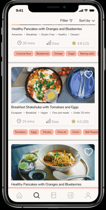
Filter and sort
Results can be filtered according to difficulty level, cooking time and special dietary needs. They can also be sorted according to difficulty, time and number of ingredients. This enables uses to quickly filter to recipes and spend less time searching.
04
Recipe details
On the recipe details page, users can see recipe’s rating, author, cooking time, difficulty and tags. They can also like the recipe to save it for later. Furthermore, they can see ingredients, directions and reviews. Serving size can also be adjusted to fit users’ needs and the ingredients amounts will get increased or decreased accordingly.

05
Making a recipe
From the recipe details page, users can access the recipe making mode. Before they start they will get a prompt window asking them whether they want to enable anti-lock screen and voice control. These features make it easier to follow a recipe without touching the phone all the time. Next, they can follow instructions step-by-step. In the end they’ll be asked to leave a review, rate the recipe or upload a photo.

06
Grocery list
After looking at the ingredients list, if a user realizes they are missing an ingredient they can add it to the grocery list to buy it later. From the grocery list they can delete ingredients or access the recipe again.
07
Clean your fridge
Users can select the ingredients they already have in the fridge and search for recipes that have same ingredients to use them up instead of throwing them away.

08
Profile page
Users can like a recipe to save it for later. Saved recipes appear on the users profile page, along with the recipes users published or recipes they tried making before.

Takeaways
What did I learn?
🟥 Iterate, iterate and iterate. It is important to keep testing the design and making changes accordingly. Even after the product is launched, the team should keep testing it and improving it.
🟥 Don’t make assumptions. I made the low-fidelity wireframes based on my idea of what users might like, but after getting feedback from classmates it turns out that they might prefer some other solution.
🟥 Ask for advice. If you get stuck on any step of the process, it is always helpful to ask for second opinion either from colleagues or from a mentor.
What are the next steps?
🟥 More user testing is needed to improve the design, make it more beginner-friendly and see how it can attract more users with new functions.
🟥 Develop the prototype further and include more functions.
🟥 Work more on branding and establish business goals.

